The Importance of a Great Logo

From Nike’s “swoosh” symbol to Starbucks’ twin-tailed mermaid or siren, the world’s largest companies take great care of their logos.

For most people the logos of such firms immediately connect our minds to the business in question, without the need to see its name.


Think of the golden arches of a popular fast-food chain, or the apple with a bite taken out of it representing a certain computer company.

This type of instant recognition is the holy grail for a business.

Which is why the world’s multinational companies can spend millions on their logos – like UK oil group BP, which back in 2000 spent £136m introducing its current sunflower design.

Other firms of a similar size, whose logo is simply their name written out in a stylised way, can spend hundreds of thousands on a new font, or a different colour.

But how easy is it for a business to pick a good logo, and how important is it at the end of the day?

Slow romance

If you are presented with a design for your company logo that is immediately likeable and resonates with your values, you might be wise to take a long hard look at it, bin it, and start again.

That’s the opinion of Sagi Haviv, partner at New York graphic design firm Chermayeff & Geismer & Haviv (CGH).

“It’s never love at first sight,” he says. “A good logo, a good trademark, gains meaning and power over time.”

CGH has been responsible for some of the most recognisable US business logos of the past 50 years, such as Chase Bank, National Geographic, Mobile, NBC and HarperCollins.

But Mr Haviv says some of the firms’ clients had to be dragged kicking and screaming towards accepting what have since become some of the world’s best-known logos.

“We remind our clients – and we open every presentation with a slide that says – it’s never love at first sight,” he says.

A recent presentation by CGH for a large corporation was a case in point. The chief executive, says Mr Haviv, could live with any of the six designs apart from number two. 

“Two hours later at the end of the presentation, he wanted number two and he wouldn’t hear of anything else,” says Mr Haviv. “This is why the relationship between the client and the designer is extremely important.”

For Mr Haviv there are three essentials to a good business logo: it must be appropriate to the business; it must be memorable; and it must be uncomplicated in form.

“And here I’d add a fourth,” he says, “which is that the concept must be original.”

Gap’s harsh lesson

Deciding whether to change a logo is also a difficult decision, as clothing giant Gap can affirm.

Back in the autumn of 2010, it unveiled a new logo, switching from writing its name in upper case to lower case letters, and introducing a small blue square behind the letter “p”.


 Such was the public outcry that a week later Gap did an about turn and scrapped the change.

Mr Haviv says: “Gap’s original logo was loved by its audience, but it didn’t know it.”

One business which has successfully changed its logo is fast-growing London publishing company Ink.


“The [current] logo was designed approximately seven years ago – it wasn’t the first logo for the company, it was the third incarnation,” says Ink’s creative solutions director Jonny Clark.

“The reason to create the logo at the time was that the company was expanding.

“It had gone from a relatively small business to a small-to-medium sized business, and we wanted to embrace the fact that we weren’t just doing [physical] print anymore, but digital work as well.”

So the word “publishing” was dropped from the old logo and the ring of colour that surrounds the word Ink was tweaked to add the tones of the RGB colour wheel that is the basis of digital printing.

Mr Clark adds: “We didn’t have a branding department and the change was done internally by the design team we had working for us.

“There wasn’t a lot of red tape to go through. In total, the process took between two-to-four months.”

While Ink cannot quantify the impact of the logo change, over the past seven years the firm has expanded overseas, adding offices in Atlanta, Dallas, Miami, Melbourne, New York, Sao Paulo, Shanghai and Singapore. So the new logo certainly didn’t hinder the business.

‘Functional signpost’

Martin Christie, of the London-based logo design firm Alchemist, says that simplicity is key. But he also cautions that firms shouldn’t rush into a decision.

He says: “It’s common sense to spend time on your logo – it’s the first thing that people see; it’s the look of your company; and it’s going to reflect what you do.”

For Robert Jones, professor of branding at the University of East Anglia, a good logo will successfully express a company’s values.

He says: “Your logo is how people recognise you, and it helps express how you’re different from your rivals – warmer, greener, stronger, and so on.

“And people need an image to look at. As Aristotle said, ‘the soul cannot think without an image’.

“But [at the same time], people assess you not on the strength of your logo, but on the quality of your product or service. So all of that real stuff matters more.”

Midlands-based independent brand consultant Rebecca Battman agrees that no matter how good a logo’s design is, it will only be successful if the company itself is trusted.

“A logo is a simple and functional signpost to help people find and indentify your business,” she says. “But for a logo to be successful, the company behind it must be a respected and trusted brand.

“A logo won’t allow a company to build a respected brand on its own.”

Additional reporting by Will Smale.

A Real-life LEGO Forest

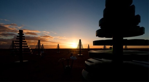
How cool is this? This isn’t a child-sized toy set: it’s actually a life-sized LEGO forest in the Australian Outback!


It’s made up of 15 pine trees, and 15 flower sets, all 66 times bigger than their design toys counterpart – making the trees a whopping 4m high.

The iconic toy brick company has built this amazing creation in Living Desert State Park, a 2400ha reserve more than 700 miles west of Sydney, as part of its 50-year anniversary celebration.

Each element has been made from a combination of medium-density fibreboard and metal, created by a company in Melbourne. The display will run from July 2-12 and LEGO is planning further surprise “plantings” later in the year.


The trees were first showcased in central Sydney back in April, greeting stunned commuters on their way to work, but we reckon the red dust plains and blue skies of New South Wales are a far better perfect backdrop for these LEGO wonders.

Brand by Hand explores the defining attributes of world-wide brands

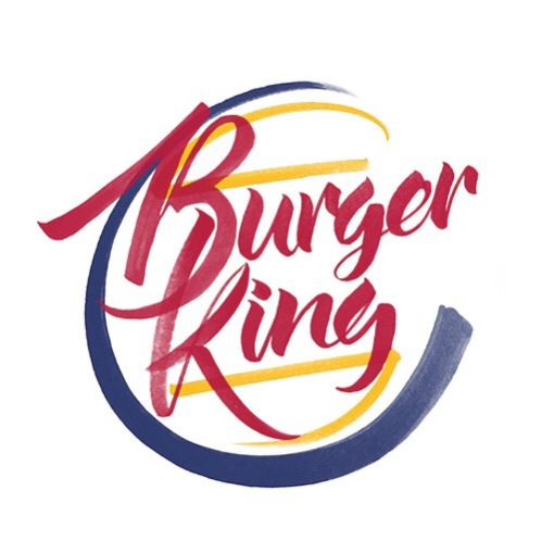
  Most of the corporate logo designsyou’re familiar with, focus on a clean and minimalist approach – think Apple and Google, with the likes of Starbucks pulling back on their initial identities to conform with this more minimal trend. Less colour and use of negative space has seen a big rise in hand-lettering.


 Auckland based designer Sara Marshall created this latest project, ‘Brand by Hand’ to explore the defining attributes of some of the biggest companies in the world. “Brand by Hand is intended as an intersection of these two trends by introducing the personal, hand-treated and flowery nature of hand lettering into the cold corporate world,” she explains. 


“The purpose, besides being a personal exploration of letterforms, is to reimagine these logos while retaining key defining elements of their original branding,” she continues. “Some examples have taken the salient features of each brand and conceptualised them in workable ways while others really challenge minimalist ideals through ornamentation and embellishment.”.”


Perhaps not the Droid you’re looking for?

It might not be the droid you’re looking for, but a plane painted to look like R2-D2 could be the next best thing for Star Wars fans waiting for The Force Awakens.


Japan’s All Nippon Airways (ANA) has unveiled a Boeing 787 Dreamliner decorated to look like the robot.

The cockpit and front half of the white fuselage are painted with blue panels in the shape of those on the droid.


Star Wars is also written on the body of the plane behind the wing.

Images released by the company show the tail in ANA’s normal livery.

All Nippon Airways says the jet will go into service on an international route later this year ahead of the film’s release.


 Fans got their first look at a new teaser trailer for Star Wars: The Force Awakens, the seventh instalment of one of the most successful movie series of all time, on Thursday.

Dazzle Dazzle

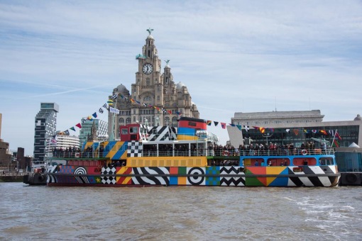
Prepare to be dazzled as the Mersey Ferry becomes the only operating Dazzle Ship in the UK!


Designed by esteemed British pop artist Sir Peter Blake, the eye-catching pattern will cover the ‘Snowdrop’ ferry for two years as part of the World War One Commemorations. Coined ‘Everybody Razzle Dazzle’ the project is commissioned by Liverpool Biennial, 14–18 NOW the First World War Centenary Art Commissions, and Tate Liverpool in partnership with Merseytravel and National Museums Liverpool (Merseyside Maritime Museum). Supported by Arts Council England, National Lottery through the Heritage Lottery Fund and Department for Culture Media and Sport.


Unlike other forms of camouflage, dazzle works not by concealing but by baffling the eye; making it difficult for the enemy to estimate a target’s range, speed and direction. Each ship’s unique dazzle pattern featured monochrome and colour in order to avoid making classes of ships instantly recognisable to enemy U-boats and aircraft.  


As well as being a moving commemorative artwork, you’ll be able to learn more about the history of dazzle and the role that the Mersey Ferries took in the First World War in an onboard exhibition. It’s curated by Tate Liverpool and National Museums Liverpool.

Wrap Advertising

Wrap advertising or a vehicle wrapdescribe the marketing practice of completely or partially covering (wrapping) a vehicle in an advertisement or livery. The result of this process is essentially a mobile billboard. Wrap advertising can be achieved by painting a vehicle’s outer surface, but an increasingly ubiquitous practice in the 21st century involves the use of large vinyl sheets as “decals”. The vinyl sheets can later be removed with relative ease, drastically reducing the costs associated with changing advertisements. While vehicles with large, flat surfaces (such as vans, buses and rail carriages) are often used, cars can also serve as hosts for wrap advertising, despite consisting of more curved surfaces


It’s incredible to see the process take place and completely change the appearance of a car or van, in the below video you can see the process from start to finish, turning a blue Chevrolet into a fully liveried touring car. 

http://www.youtube.com/watch?v=FK3H3Afy-ew

This must require incredible skill and definitely not something I think I could manage, I struggle to put a screen protector on my phone without leaving bubbles!!


How typography can give your brand personality

Lippincott’s Rodney Abbot explores how brands are creating their own typefaces to set themselves apart


In today’s hyper-connected world, we exchange more words than ever before. While text messaging is in decline for the first time ever, the proliferation of channels through which we communicate means our devices are flooded with information.

But for brands, there’s much more to these words than just the message they convey. As consumers increasingly look to each other for inspiration and guidance – through the likes of social media, blogs, vlogs and reviews – brands also need to become more communicative, hands-on and human, with their own distinct personality.

While typeface is an often overlooked tool, as the core vehicle of communication, it should be the first port of call when it comes to shaping brand personality. At Lippincott, we call the shift from brand to consumer focus ‘The Human Era‘, a period in which brands must build connections through authentic stories, signature innovations and inspiring experiences that are rich, powerful and lasting.

 Unique typefaces

As a result, we are seeing companies straying from standardised typefaces because they just don’t reflect their brand. Rather than being confined to the computers pre-loaded system fonts, brands are creating their own unique typefaces to be in tune with their increasingly human side and claiming ownership of their identities. It’s our idiosyncrasies that make us stand out from the crowd.

Digital media is the key catalyst for this shift. Brand messaging used to be confined to a limited number of channels; but now websites, inter-connectivity and more mobile devices, bringing with them the need for mobile-first and responsive interfaces, mean the ongoing roll of typeface that brands feed into the world is of vital importance.

As well as needing to connect on a pictorial level with the brand logo and related imagery, type has to work across a variety of situations, carrying the brand story when the environment is very informational and remaining functionally credible in a highly promotional context.

Being human


 Type was key to Lippincott’s rebranding work for Southwest Airlines

But just as typefaces need to be consistently effective, they must also perform like humans, showing different parts of the brand’s personality at different times, which is why the design process is particularly intricate and multi-layered.

Having recently curated a new collection of ‘human’ typefaces with Monotype, a leading provider of typefaces, technology and expertise for creative applications, Lippincott’s mission was to showcase how different personalities can be achieved through type. Launched last month, Brands with Heart presents a number of typefaces that connect on an emotional level.

One of the most interesting features about these typefaces is that they reveal a glimmer of the typographer behind them.

Ordnance Survey

National mapping agency Ordnance Survey has launched a new brand identity which aims to better reflect its digital and data services and appeal to a younger audience. We spoke to marketing and communications director Katie Powell, who led the project, about the new look…

IMG_1530
The brand refresh was a collaboration between OS and London agency Other and is the first Ordnance Survey has undertaken in 15 years. While the organisation has traditionally been best known for its paper maps, OS says these make up only five percent of its revenue today – the bulk of its work is providing geographic data for businesses, government agencies and local authorities, as well as online maps and databases for the public.

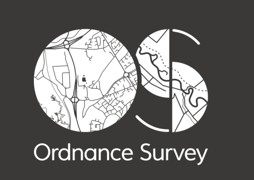
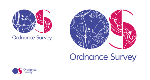
The symbol replaces OS’ previous marque, made up of an O and S with an arrow in between (pictured above) and three versions have been designed: a standard one for use in most applications, a richer one with more detailed maps for large-scale use and a smaller, simplified marque for use at very small sizes, such as on the spines of maps:
“It was very important that the new logo worked in different scales, and reflected our work mapping urban and rural areas,” explains Powell. “The major problem with the previous branding was that it didn’t work in the digital space – the flat arrow just said paper maps, as people are used to seeing 3D ones in digital navigation,” she adds.
The brand’s official colours are midnight blue, rubine red and charcoal. A red and blue version of the logo will appear online and on maps, merchandise, uniforms and communications, while charcoal and white will be used against photographic, brightly coloured or contrasting backgrounds. The red and blue signify navigation and discovery in mapmaking and are also based on OS’ previous logo, explains Powell.

“We tested our colours and although not everyone liked the pink, it was very well recognised, so we had to balance keeping that recognition with modernising colours to make it look a little more contemporary,”

she says. The idea was also to create a flexible, dynamic logo which, like Google’s, could work in a variety of colour combinations, adds Powell.
A bespoke typeface, OS Meadows, was created specifically for use within the logo and will be used alongside OS Gill Sans for headlines, titles and apps, and PT Sans Narrow, Source Sans Pro or Arial for body copy. A secondary colour palette helps group the company’s services into three core areas: mapping, data and solutions, signified by orange, deep purple and a lighter blue respectively, and new maps will be colour coded to help users distinguish between products (for example, green for road maps and orange for ‘explorer’ maps).

The new branding also includes a greater focus on photography – Ordnance Survey is launching a competition which will see winning images submitted by the public applied to the covers of paper maps, and is working with landscape photographer Charlie Waite to establish a bank of original imagery, some of which can already be seen in its head office. Detailed guidelines on the use of stock photography recommend natural shots, aerial views and the use of clever cropping, while avoiding over stylised images or shots of people looking directly into the camera.
Powell says it is the first time photography has played a key role in the organisation’s identity, adding:

“We’re a very technical organisation, but I think photography will help us capture people’s imagination and be more emotive. There’s going to be much more of a focus on it [in branding] from now on.”

IMG_1532
The rebrand was launched in response to research carried out last year with over 2000 consumers, which revealed OS was best known by males over 55 and while respected, wasn’t seen as ‘digital’ or ‘iconic’.

IMG_1533
“We’ve done very little with the brand in the past 15 years and while it was well loved and used, it wasn’t well presented to the younger generation. It needed to work more effectively in the digital space and convey its message to a broader audience, modernising but still staying true to the company’s roots,” she explains.
As well as a new visual identity, the brand has launched a new strapline, ‘OS. Finding a way.’ and a new mission statement: ‘OS provides mapping that informs, guides and inspires’. Over time, Powell says Ordnance Survey is keen to be known simply as OS, but adds: “there needs to be a period of transition. I don’t think we’re ready for that just yet.”
It’s a sensitive redesign, presenting a much more contemporary image for the brand without straying too far from OS’ previous identity. “We tried out some more radical looks, but they didn’t sit well with employees or the public,” adds Powell.
The new logo is far better suited to digital applications and, coupled with new photography guidelines and colour coding, should help provide a more flexible yet consistent visual system. While the new look will be rolled out across all internal and external communications, Powell says it has been a conservative exercise. “In many cases, we’ve replaced things as we’ve run out, and we’ve been very careful not to spend money wastefully,” she adds.

Jura Whiskey

Jura whisky, one of the world’s fastest growing malts, has revamped its packaging to make the brand stand out on shelf and to clearly explain the distinct flavour profiles of each expression.

I’ve always been a fan of the way Jura Whiskey looks on the shelf, the use of photography and contemporary design means it stands out from the more traditional branding.


Each carton will have its own distinct colour palette featuring a different image, drawn from the landscape of Jura.  The image that adorns each carton connects back to the whisky’s distinct island story and sits beside a half outline of the distinctive Jura bottle shape.  When the expressions are lined up together the outlines join up to reveal the whole outline of the iconic Jura bottle.


Gemma Parkinson, Jura Brand Manager commented: “2012 was an exceptional year for the brand. We are now looking to build on this momentum and release a new creative look and feel that we hope will resonate with consumers and help them to truly identify with our brand story.”

About Jura

Off the west coast of Scotland lies one of nature’s best kept secrets, the Isle of Jura.  Populated by a community of less than 200, known as Diurachs (the Gaelic name for the people of Jura), the island is home to Jura distillery and an award-winning range of single malt whiskies.

There are four classic bottlings in the Jura Collection, each with their own distinctive flavour profiles: the light and delicate Origin 10; the rich and full bodied Diurachs’ Own 16 year old; and Superstition and Prophecy, which are lightly and heavily peated respectively.

Jura whisky, as we know it today, was born in the late 1950s when two local estate owners – Robin Fletcher and Tony Riley-Smith – took the bold decision to rebuild the Jura distillery following decades of neglect, employing architect William Delme-Evans. By 1963 their work was complete, providing much needed economic support for an isolated island community.

The story of the distillery’s rebirth is one of many that define the unique character of Jura, the islanders and their whisky. From the Writers’ Retreat to the annual Music and Whisky Festivals, Jura continues to generate stories worth telling.

To find out more visit www.jurawhisky.com

Iconic silhouette in the sand

Not many individual cars can be instantly recognisable from a silhouette, let alone a silhouette drawn in the sand.

Six Land Rovers towing chain harrows took three hours to create the iconic 1km image of the Land Rover Defender in the sands of Red Wharf Bay on Anglesey. The very place it was originally thought of.


“My father Maurice met his brother on the beach, He was explaining the concept for a new idea for a go-anywhere, do-anything vehicle. He made a drawing in the sand of an outline of how he thought the Land Rover could be made.” Stephen Wilks

The Wilks family owned property in the vicinity of the beach and Maurice, inspired by the WWII jeeps left behind by allied troops, wanted to create a utility vehicle that would serve the various needs of a country estate. The design, fleetingly etched in the sand that day, lives on still recognizable in today’s Defenders, due to end production in 2015.


To mark the passing of the most iconic 4×4 vehicle in the history of motoring, Land Rover hired a team of artists to create a large scale drawing of a Land Rover in the sand at Anglesey. To create the image, they used six vehicles, each of which defines a significant point in the development of the Land Rover model. A Land Rover Series I, II, and III, an early 90, a 2014 Defender 90 Hardtop and a Defender 110 Station Wagon. The Series II used was once a Wilks family vehicle and was driven for the event by the sons of the Wilks brothers.


The vehicles each towed a 12-foot wide chain harrow to make the markings in the sand. The path was plotted in advance by GPS and was finished just as the tide rolled in to begin washing it all away. The sand drawing was, at 1 kilometer in length, the largest sand drawing ever made in the UK.

It is a fitting tribute to the Defender to come full circle, from humble beginnings to arguably the most recognisable symbol of British automotive design and a must have for adventurers, farmers and mountain rescue teams that typifies the idea of a go-anywhere vehicle.