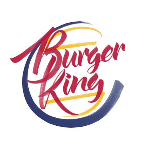
Brand by Hand explores the defining attributes of world-wide brands
 Most of the corporate logo designsyou’re familiar with, focus on a clean and minimalist approach – think Apple and Google, with the likes of Starbucks pulling back on their initial identities to conform with this more minimal trend. Less colour and use of negative space has seen a big rise in hand-lettering.
 Auckland based designer Sara Marshall created this latest project, ‘Brand by Hand’ to explore the defining attributes of some of the biggest companies in the world. “Brand by Hand is intended as an intersection of these two trends by introducing the personal, hand-treated and flowery nature of hand lettering into the cold corporate world,” she explains.
“The purpose, besides being a personal exploration of letterforms, is to reimagine these logos while retaining key defining elements of their original branding,” she continues. “Some examples have taken the salient features of each brand and conceptualised them in workable ways while others really challenge minimalist ideals through ornamentation and embellishment.”.”


No trackbacks yet.